

How does switching a Probability-Based Online Panel to a Smartphone-Optimized Design Affect Response Rates and Smartphone Use?
Felderer, B., Herzing, J.M.E., Bruch, C., Krieger, U. & Blom, A.G. (2021). How does switching a Probability-Based Online Panel to a Smartphone-Optimized Design Affect Response Rates and Smartphone Use? Survey Methods: Insights from the Field. Retrieved from https://surveyinsights.org/?p=15510
© the authors 2021. This work is licensed under a Creative Commons Attribution 4.0 International License (CC BY 4.0) 
Abstract
In recent years, an increasing number of online panel participants respond to surveys on smartphones. As a result, survey practitioners are faced with a difficult decision: Either they hold the questionnaire design constant over time and thus stay with the original desktop-optimized design; or they switch to a smartphone-optimized format and thus accommodate respondents who prefer participating on their smartphone. Even though this decision is all but trivial, little research thus far has been conducted on the effect of such an adjustment on panel members’ survey participation and device use. We report on the switch to a smartphone-optimized design in the German Internet Panel (GIP), an ongoing probability-based online panel that started in 2012 with a desktop-optimized design. We investigate whether the introduction of a smartphone-optimized design affected overall response rates and smartphone use in the GIP. Moreover, we examine the effect of different ways of announcing the introduction of the smartphone-optimized design in the invitation email on survey participation using a smartphone.
Keywords
device use, online panel survey, smartphone-optimized design, survey participation
Copyright
© the authors 2021. This work is licensed under a Creative Commons Attribution 4.0 International License (CC BY 4.0)
Introduction
Panel studies are designed to measure individual change over time (Duncan and Kalton, 1987). For this purpose, the same persons are interviewed repeatedly with the same questions over days, months, years, and even decades. Keeping the survey instrument the same allows for comparisons of survey answers over time. However, some societal changes require researchers to adapt the panel survey to new contexts, such as deleting, adding, or adapting survey questions to current political events and introducing new measurement formats.
Over the past decade, digital innovations have deeply affected our means of communication with each other (Hilbert and López, 2011). As a by-product of this technological change, the diversity of devices used to access the Internet has increased (see Sarwar and Soomro, 2013). At the same time, the Internet revolution has generated a large industry of online data collection, including online surveys and online panel studies (Cornesse et al., 2020). These online surveys observe an increasing diversity in the devices used to participate in online surveys (Bosch et al., 2019; Haan et al., 2019; Link et al., 2014; Lugtig and Toepoel, 2016; Poggio et al., 2015; Toepoel and Lugtig, 2014; Toepoel and Lugtig, 2015) with a downward trend of PC usage and an upward trend of mobile device, especially smartphone, usage (Callegaro, 2010; Millar and Dillman, 2012; Callegaro et al., 2015).
In the last couple of years, the share of respondents using mobile devices was overall rather low in online panels, however, research shows that panel respondents switch devices over the lifetime of an online panel (Lugtig and Toepoel, 2016; Poggio et al., 2015). For example, Poggio and colleagues (2015) found that about 8% of their probability-based online panel members occasionally used a mobile device to participate in their panel. This change of device use among panel members questions the traditional desktop-optimized design of online panels. Differences in the display of questionnaires across devices might result in differences in survey experiences for respondents using smartphones compared to desktop PCs, which potentially affect nonresponse and measurement (Couper and Bosnjak, 2010).
Under desktop-optimized design we understand a survey layout that is optimized for a large screen size, e.g., using vertical and horizontal scales and questions in matrix format. These elements can be problematic for smartphones as screen sizes are smaller, and access to keyboards is limited with smartphones compared to desktop PCs, laptops and tablets (e.g. de Bruijne and Wijnant, 2013; Lugtig and Toepoel, 2015). A smartphone-optimized design in contrast is designed for and implemented on a smartphone and then transferred to other devices, such as tablets or desktop PCs (see also Antoun et al., 2018). The screen layout is adapted to the screen size of smartphones (e.g. de Bruijne and Wijnant, 2013; Lugtig and Toepoel, 2015), question text and buttons are larger displayed, more space is given between buttons, and horizontal and vertical scrolling is avoided (Antoun et al., 2018; Revilla and Couper, 2018). In summary, smartphone-optimized online surveys are specifically designed to suit the needs of smartphone use (for details on smartphone-optimized designs see Antoun et al., 2017; Mavletova and Couper, 2014, Mavletova and Couper, 2016).
Academically-run online panels have for a long time hesitated to adapt their design to suit the rising number of smartphone participants for fear that design changes may negatively affect both the longitudinal measurements across survey waves and the cross-sectional measurements across participants on different devices (see for example Blom et al., 2016; for an investigation on mode effects on answer behavior see for example de Bruijne and Wijnant, 2013). However, with the increasing proportions of smartphone participants today, the diversity in device use across online panelists and the ensuing consequences for survey measurement and participation can no longer be ignored.
Research shows that ignoring smartphone respondents’ needs leads to low smartphone retention rates and higher nonresponse rates for smartphone users than for desktop users (Antoun et al., 2018). Further research indicates that once panel members used a smartphone in an online panel with a desktop-optimized design, it was very unlikely that they used a smartphone again (Lugtig and Toepoel, 2016). In addition, research on unit nonresponse of mobile device users in desktop-optimized online panels has indicated that the nonresponse rates are twice as high for mobile device users as for desktop PC users (Poggio et al., 2015). This gives evidence that ignoring smartphone respondents might negatively affect unit nonresponse in an online panel. Changing to a smartphone-optimized design on the other side might compensate for these effects and motivate smartphone users to respond. Nonresponse of smartphone users challenges the quality of a panel for two reasons: first, any nonresponse decreases response rates and thus the precision of survey estimates. Second, nonresponse can lead to nonresponse bias if nonrespondents are different from respondents (Groves, 2006). Related to the latter point, Lugtig et al. (2016) find that smartphone respondents are younger and less educated than desktop respondents.
The surge in the number of online survey participants that use their smartphone leaves online panels three options: First, they may continue using the original desktop-optimized design ensuring measurement equivalence over time. In such designs, however, on smartphones the questionnaire screens will be displayed in very small font or necessitate vertical and horizontal scrolling when zoomed in. As the proportion of smartphone participants is constantly increasing in online panels, keeping a desktop-optimized design seems to be unprogressive and might discourage certain subgroups to participate with their mobile device or participate at all (see for example Lugtig et al., 2016). A second approach, one taken by many commercial nonprobability online panels, is to adapt the questionnaire design to the device used (so called content-to-device adaptation or responsive [questionnaire-]design). For example, matrix questions are displayed in a grid on the computer screen, but on smartphone screens each item is displayed individually on separate pages (Funke and Borger, 2015). However, this approach puts the measurement equivalence across devices at risks. For example, some studies found that presenting matrix questions provokes higher intra-item correlation or straight-lining than presenting items on separate pages (see for example Silber et al., 2017; Mavletova et al., 2017). Thus, a responsive questionnaire design can conflict with the central aim of a longitudinal online study to obtain repeated measurements that are independent of measurement error and changes in measurement error over time. Different visual designs might be prone to different measurement error (see for example Stern et al., 2007). It therefore seems problematic to field different designs to different respondents at one point in time or to change the design for the same respondents over time dependent on the device they use. The third option is to develop a smartphone-optimized questionnaire design that is developed specifically for the needs of smartphone participants (Callegaro et al., 2015) and to display it in the same way on all devices. A smartphone-optimized design assumes that the choices made in favor of smartphone use will translate well to the larger computer screens and thus deliver the highest measurement equivalence across devices.
When online panels switch from a desktop-optimized to a smartphone-optimized design, survey practitioners must decide whether they want to inform their panel members about the design changes or not. There are good arguments for informing the panel members about the design changes: informing panel members about the design changes can encourage people to participate via smartphone (see Toepoel and Lugtig, 2014) or participate again in the panel study because the survey design is now optimized for their preferred device (see Dillman et al.(2014) for effects of mode preferences on response rates). Not informing panel members of the design changes on the other hand could confuse panel members and put them at risk for survey breakoff or panel dropout. Either way, the communication of the survey design change can affect panel participation.
When informing panel members on the new design, survey practitioners need to decide on how and where to place the information in the invitation email. Previous research shows that the design of invitation emails can affect response behavior (see for example Kaplowitz et al., 2012; Callegaro et al., 2015). The information about the new design can be placed either in the main text of the invitation email or/and in addition in the subject line. The main text has the advantage to offer more space for detailed information but the disadvantage that these might not reach the readers’ attention when they are imbedded within a longer email text. This might be especially problematic in a panel context, where panelists received the same email multiple times before and do not expect new content. Attention to the information about the new design might furthermore depend on a respondent’s interest in responding using a mobile device. The advantage of the subject line is to place the information more prominent, but the number of words is limited. The main text of an email can contain many different aspects of the survey which cannot all be mentioned in the subject line (Brenner et al., 2020) and a subset of aspects needs to be selected. Consequently, one must carefully decide whether to put information into the main text and/or in the subject line. So far, there is little literature on how to introduce a new questionnaire design for a specific group of panel respondents and how it influences panel participation and more experimental research is needed.
We study the effects of introducing a smartphone-optimized survey design to a long-lasting desktop-optimized online panel, namely the German Internet Panel (GIP). We report on panel members’ device choices before and after the design switch and investigate participation rates, smartphone rates and smartphone retention rates by panel waves in a time series approach. We thereby ask the following questions:
- Is the introduction of the smartphone-optimized design accompanied by a change in the overall GIP response rate?
- Is the introduction of the smartphone-optimized design accompanied by a change in smartphone use for GIP questionnaire completion?
- Is the introduction of the smartphone-optimized design accompanied by a change in respondents’ retention in smartphone use?
To study the impact on whether and how the information about the design change affected survey participation, the design change was accompanied by an experiment varying the invitation emails. The experiment included three experimental groups: the first group received the standard invitation email that was sent in the previous waves without any information about the new smartphone-optimized design (control group), the second group was informed about the smartphone-optimized design by adding a paragraph to the main text that says that the survey design has changed to better serve the needs of smartphone users (text group), and the third group was informed about the smartphone-optimized design in the main text and the subject line of the invitation email (text & subject line group).
Due to random distribution of GIP participants to the experimental groups, the groups should include the same amount of respondents who are eager to participate by smartphone. Comparing the control to the text group we ask
- Does informing panel members about the new design in the invitation email increase smartphone response?
Concerning the placement of the information we compare the two treatment groups and ask
- Does informing panel members about the new design in the subject line and main text yield more smartphone response than informing them in the main text only?
Attention to the information about the mobile-optimized design might depend on respondents’ interest in responding using a mobile device. Taking past smartphone use to complete the GIP survey as an indicator for the interest in mobile response, we raise the question
- How, if at all, is the effect of the different ways of informing respondents about the new design moderated by GIP panelists’ earlier smartphone use?
Data and Methods
Data
The GIP is a large, national, probability-based online panel of individuals living in households in Germany. The GIP was started in 2012 with a recruitment that proceeded in two steps (Blom et al., 2015): in the face-to-face phase, interviews were conducted with one household member containing questions about the household composition, socio-demographics and whether the household had a computer and a broadband Internet connection. In the second phase, all household members aged between 16 and 75 were invited to participate in an online panel. Non-Internet households were equipped with Internet access and/or devices to use the Internet for panel participation (for further information on the GIP see Blom et al., 2017; Blom et al., 2015). All respondents who completed the online questionnaire are considered GIP panelists and are invited to participate in the panel wave every other month.
A second recruitment was conducted in 2014 on which the present study focuses on. The panelists from the 2012 recruitment are excluded as they do not compare to the panelists from the 2014 recruitment as they have been subject to more panel attrition and potential selectivity. The design change was fielded in 2016 in the 12th wave for the 2014 panelists.
To fulfill the needs of smartphone users, the GIP switched from a desktop-optimized design to a smartphone-optimized design four years after the panel was founded. With smartphone-optimized we mean a design that is optimized for the use on small smartphone screens rather than larger PC screens. The smartphone-optimized design is transferred to all other devices to assure measurement equivalence. The following five major design changes were implemented: First, to avoid the need for zooming in the screen, the question text and the next-button were displayed larger. Second the space between radio buttons and the space around radio buttons were extended to make clicking on small smartphone screens easier. Third, questions were designed in a way that no horizontal or vertical scrolling was necessary. Fourth, horizontal scales and matrix questions were transformed into smartphone compatible vertical scales and single questions. And fifth, the screen size on smartphones was adjusted to match the screen size of smartphones instead of the screen size of a desktop computer.
Methods
The first part of the analyses – overall response and smartphone use in the GIP – includes all panelists who participated in at least the first wave after the face-to-face recruitment interview (resulting in 3,209 respondents).
For the invitation letter experiment, we excluded all panelists who are classified as non-Internet households (persons who were provided with (non-mobile wired) Internet access and/or a computer) who do not have the equipment to participate using a smartphone or who actively left the panel (by informing the GIP that they do not want to participate anymore) before the invitation letter experiment was conducted. In total, 2,624 panelists are part of the invitation experiment.
For our first three research questions, we analyze the overall response rates, mobile response rates and smartphone retention rates over panel waves. All three rates are subject to an increasing or decreasing underlying trend, respectively. To be able to distinguish the effect of the design change from the underlying trend, and to see whether the design change leads to a further decrease or increase of the rates, we test whether the trend is different before and after the introduction of the new design, e.g., whether we observe a structural break in the underlying trend. We use a Chow test to test whether the design change is associated with a significant structural break in the underlying trend. In the following we briefly describe the general idea behind the Chow test (for further information see for example Zeileis et al. (2003) on who the following explanation is based).
To study an increasing or decreasing trend in the response and smartphone rates over time, we regress these rates on time, i.e., panel waves. The general idea of the Chow test is to determine whether it is better to regress the dependent variable on time using a single linear regression model including all time points or by using two models, one for the time before and another for the time after a structural change, e.g., the switch to the smartphone-optimized design. In case the two separate models are preferred we conclude that the structural change is associated with a significant structural break in the underlying trend.
In the first step, a linear regression model is fitted over all time points, which in our case are all panel waves:
![\[ y_t= wave_t'\beta_t + u_t \quad (t = 1, \ldots, n), \]](https://surveyinsights.org/wp-content/uploads/ql-cache/quicklatex.com-5f8e0bf5a01aec13afe748bdef159d8b_l3.png "Rendered by QuickLaTeX.com")
where in our case  equals the response rate, smartphone rate or smartphone retention rate at time
  ,
,  is a vector of the n waves,
  is the error term with
  ,
,  is the vector of regression coefficients and n is the number of waves in our study.
Assuming a structural change in the trend at wave  , in a second step two separate regression models are fitted for the waves
  and
and  :
:
![\[ y_t= wave_t'\beta_{1,t} + u_{1,t} \quad (t = 1, \ldots, t_0), \]](https://surveyinsights.org/wp-content/uploads/ql-cache/quicklatex.com-19eb44e64632a7670fab3dba6ce16b0c_l3.png "Rendered by QuickLaTeX.com")
and
![\[ y_t= wave_t'\beta_{2,t} + u_{2,t} \quad (t= t_0 + 1, \ldots, n), \]](https://surveyinsights.org/wp-content/uploads/ql-cache/quicklatex.com-fe3eae82dd080e2e0a8348cb02ead68f_l3.png "Rendered by QuickLaTeX.com")
allowing the regression coefficients from equation 2 ( ) to differ from those in equation 3 (
 ). The
  and
and  are the respective error terms of the separate models. The Chow test uses an F-test statistic to decide whether the sum of residuals of the overall model is significantly larger than the sum of residuals of the separate models. From significant larger residuals for the overall model than for the separate models follows a rejection of the null hypothesis of the Chow test (“no structural break”) in favor of accepting the alternative assumption of a structural break. In general, it is the aim of the Chow test to study structural breaks at pre-specified time points. A structural break at one time point does not mean that there are no further structural breaks in the time series. Testing other time points for structural breaks, however, should always be guided by theory and the Chow test should not be used to search a time series for structural breaks.
For our application, we study our first research question on whether the introduction of the smartphone-optimized design is accompanied by a change in the overall GIP response rate by testing whether wave 11 represents a significant structural break in the response rates over the waves.
For our second research question on whether the introduction of the smartphone-optimized design is accompanied by a change in smartphone use for GIP questionnaire completion, we test whether wave 11 is a significant structural break in smartphone rates.
Our third research question asks whether the introduction of the smartphone-optimized design accompanied by a change in respondents’ retention in smartphone use, e.g., whether respondents who used the smartphone in the previous wave will again use the smartphone in the current wave. If respondents who use the smartphone after the design change in wave 12 stay using smartphones at a higher rate than before, we expect wave 12 to represent a significant structural break in the underlying trend of increasing smartphone retention rates.
The questions on whether and how the information about the design switch impacts smartphone participation (fourth and fifth research question) are answered using t-tests comparing smartphone rates between wave 11 and wave 12. The sixth research question on whether the invitation email effect is moderated by previous smartphone use is investigated by fitting a logistic regression model of mobile participation in wave 12 depending on experimental group and mobile history.
Results
To investigate whether the composition of the devices used to complete the questionnaires changed across panel waves, Figure 1 shows the overall response rate to the GIP and the rates of devices used to respond to the GIP over 24 waves.
The share of panel respondents and device users are all divided by the total number of participants to the first regular panel wave. As can be seen in Figure 1, the overall response rate decreases over panel waves, so does the rate of desktop PC participants. The response rate curves, however, are not parallel and the decrease of the rate of desktop respondents appears to be steeper than the decrease of overall response rate indicating that the decrease in desktop respondents cannot solely be explained by wave-to-wave nonresponse or attrition. The differences in the decreasing trends can be explained by the fact that contrary to the rate of desktop participants the rate of smartphone participants is increasing over the waves. Figure 1 illustrates three underlying trends in the GIP: a decrease in overall response rates, a decrease in desktop participation, and an increase in smartphone participation rates leading to a change in the composition of devices used to participate in the panel (the numbers of respondents and specific device users can be found in Appendix B, Table A1).
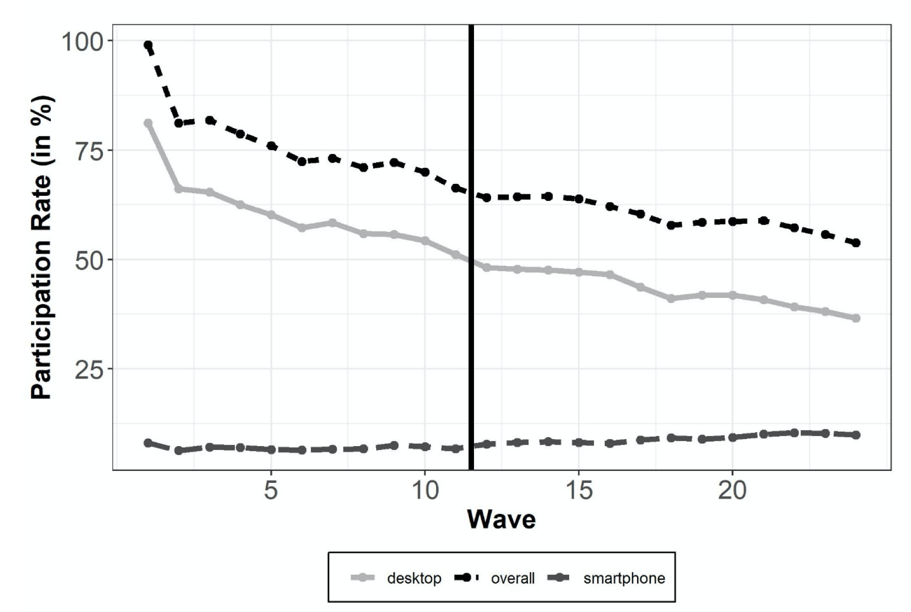
Figure 1: Overall response rates to the GIP across panel waves and rates of devices used to complete the surveys in percentages (vertical solid line indicates survey design change).
To answer our first research question, we test whether the decrease in overall response rates from wave 1 to wave 24 can be explained by a stable underlying decreasing trend or whether wave 11 marks a structural break. The Chow test finds a significant structural break in the underlying trend of decreasing overall response rates (F = 7.043, p < 0.05, for an illustration see Appendix C, Figure A3) indicating that the decrease in the overall response rates is significantly less steep after the design change than before the design change[1].
To investigate whether the survey design change affects the device use in the GIP, we examine the evolution of the mobile device use across panel waves. Figure 2 presents the overall smartphone use rate in percentages as well as the smartphone use rates split by the devices used in the previous wave: the rate of smartphone respondents who switched from a desktop computer to smartphone (desktop-smartphone), from nonparticipation to smartphone (na-smartphone) and who continued using a smartphone (smartphone-smartphone, which we also refer to as “smartphone retention” rate).

Figure 2: Overall smartphone use rate and smartphone use depending on device used in the prior wave across panel waves in percentages (vertical solid line indicates survey design change).
We can see from Figure 2 that the smartphone rate has continuously been increasing from the first wave on (from 8.1 % to 9.8 %). Answering our second research question, we apply a Chow test to determine whether wave 11 marks a structural break in the increase in the overall smartphone rate (F = 11.13, p < 0.05). We conclude that the increase in smartphone rates is significantly steeper after the design change than before the design change. As can be seen from Figure 2, the increase in the smartphone rate is mostly driven by the continuously increasing smartphone retention rates: more and more respondents using a smartphone continue using a smartphone in the subsequent waves (increase from 3.5 % to 7.3 %). The switches from other devices (mainly desktop PCs) or nonresponse to smartphone use fluctuate but do not show an increasing or decreasing trend.
Answering our third research question on smartphone retention, we test whether wave 12 denotes a significant structural break in the common increasing trend of the smartphone retention rate (Chow test F = 17.081, p < 0.05). The introduction of the smartphone-optimized design leads to an increase in smartphone retention rates that is steeper after the design change than before the design change. More respondents repeatedly used the smartphone after the introduction of the smartphone-optimized design in the subsequent 13 panel waves.
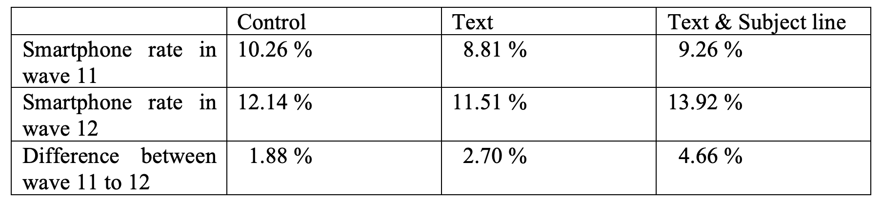
In total, 2,076 panelists responded in wave 12, 253 of them (12.2 %) using a smartphone. The following analysis only includes the 1,946 respondents who were part of the invitation email experiment[2], excluding non-Internet households (651 panelists in the control group, 634 in the text group, and 661 in the text & subject group).
To answer our fourth and fifth research question about the effect of the different ways of informing panel members about the new design in the invitation email on the device use in the following wave, we investigate smartphone use in wave 11 and wave 12 across experimental groups. We find increasing smartphone rates for all experimental groups (see Table 1), which is in line with our observation of a continuously increasing smartphone use (see Figure 2). For the text & subject line group respondents’ smartphone use is increased by 4.7 % while the increase is about 2.7 % for the text group. We also find an increase in the smartphone rate for the control group (1.9 %). However, the difference between the waves is only significant for the text & subject line group but not for the text group which might be explained by the relatively small prevalence of smartphone use as compared to other devices. The findings indicate that promoting the smartphone-optimized design in the invitation email (significantly) increases smartphone use as compared to the previous wave.
Table 1: Smartphone use in wave 11 and wave 12 in percentages including t-test results for differences in smartphone use between the waves. Differences in smartphone use in wave 11 are not significant for the control and text group (p > 0.1) or control and text & subject group (p > 0.1).
The results of our sixth research question on how, if at all, the effect of different ways of informing panel members about the new design in the invitation email on device use in the following wave is moderated by GIP panelists’ earlier smartphone use is presented in Table 2. Model 1 presents a logistic regression of using a smartphone in wave 12 (as opposed to any other device) on the experimental groups of the invitation letter experiment and on an indicator for the last time a panelist responded via smartphone (last wave vs. within the last year (but not last wave) vs. more than a year ago vs. never). As we are mostly interested in the interactions of the experimental condition and the last time a panelist responded via smartphone, we extend model 1 by adding interactions between the experimental groups and previous smartphone use (see model 2). Since we are analyzing a randomized experiment, we do not include further control variables.
We next turn to the estimated effects in both models. Model 1 shows no significant main effects of the experimental groups on smartphone use in wave 12. The past smartphone rate, however, significantly affects the mobile device choice in wave 12: the longer ago the smartphone was last used, the less likely are respondents to use a smartphone in wave 12. Respondents who never used a smartphone before are least likely to use a smartphone after a smartphone-optimized survey design was promoted in the invitation email.
Table 2: Logistic regression of smartphone use in wave 12 on the experimental groups and last smartphone use. Standard errors are presented in parenthesis. The likelihood ratio test (LR) does not find a significant difference between the model with and without interactions (LR test = 10.37, d.f. = 6, p = 0.110).
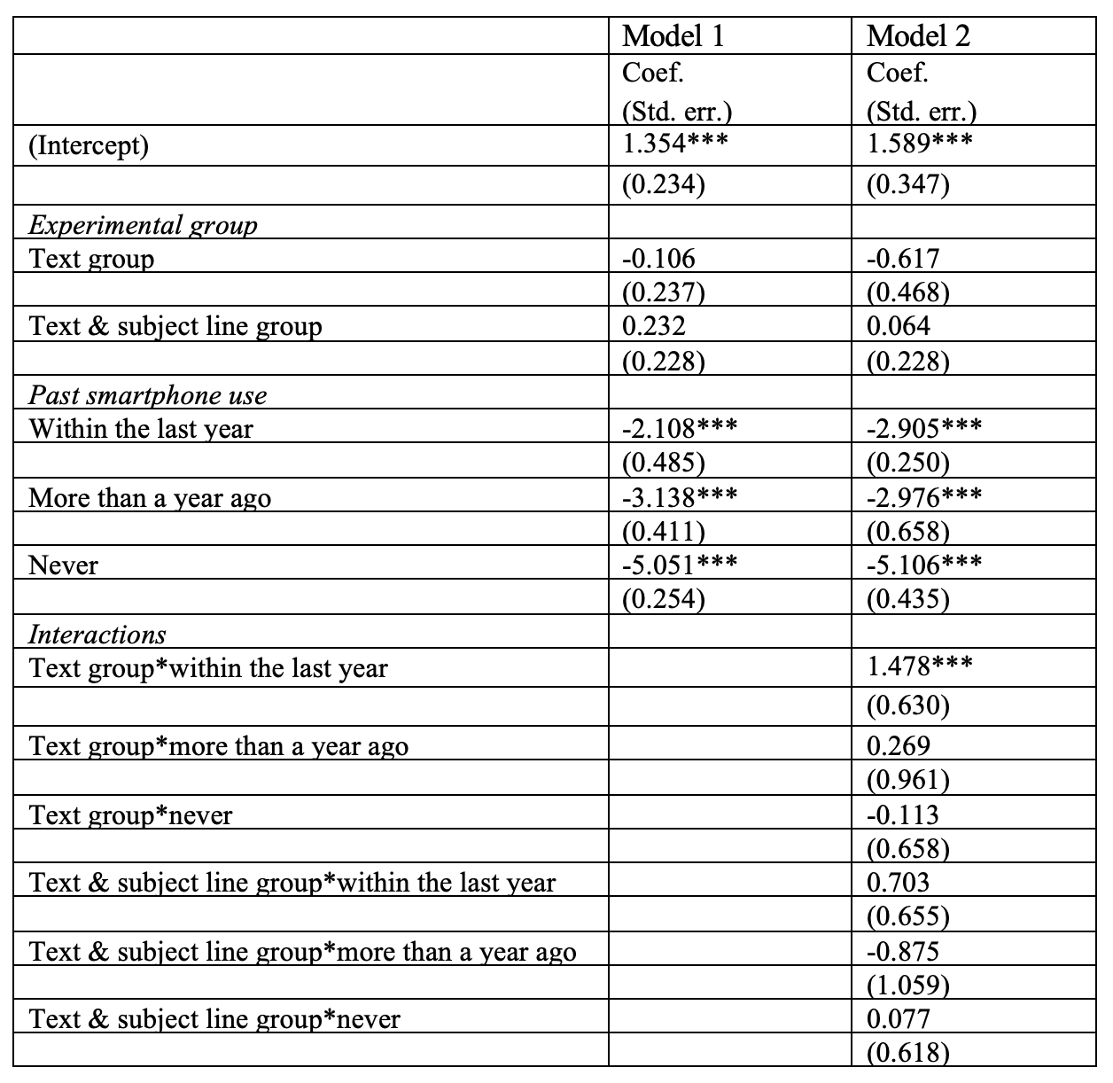
Note: Coef. = regression coefficient; Std. err. = standard error; n= 1,946. *p<0.05, **p<0.01, ***p<0.001
Turning to Model 2, we find that none of the interaction effects are significantly different from zero expect for the interaction of text group and smartphone participation within the last year. We perform a likelihood ratio test to check whether including interactions improves the model. The likelihood ratio test does not find the models to be significantly different (p = 0.110) so we conclude that respondents’ past smartphone use does not moderate the effect of the different ways of informing respondents about the new design.
Summary and Conclusion
Online panel surveys with a long lifetime can face challenges posed by societal and technological change. Especially, the technological change increased the use of mobile devices in general and increased the use of mobile device to respond to survey requests. The question at hand is whether online panels should adapt to these changes and more specifically, whether they should adjust their desktop-optimized survey design to a smartphone-optimized survey design.
The aim of our study was to analyze the effects of the survey design changes from a desktop-optimized to a smartphone-optimized design on mobile survey participation. Even though the vast majority of panelists (68%) is still using the desktop for completing the survey in wave 24 of the GIP, the general trend suggest that desktop use will further decrease and smartphone use will increase in the next couple of years.
Our results show that the survey design change is accompanied by decreasing panel attrition rates and an increasing trend in smartphone response rates that gets steeper after the design change. Moreover, the increasing trend in smartphone retention rates is found to be steeper after the design change.
Even though we cannot be sure that the positive changes in the trends can be attributed to the design change, we clearly did not find any evidence on negative associations of the design change with survey participation in our analysis. In addition, results from other studies are encouraging the use of smartphone-optimized designs, as they find only slight differences in measurement between desktop computer and smartphone respondents (see Antoun et al., 2017; Mavletova and Couper, 2013). Therefore, it is likely that ongoing online panels gain from higher retention of smartphone users when adjusting the survey design to smartphones. In the long run, an increasing number of online panel members may adjust to the technological change by using smartphones to participate in panels. Thus, the question of how to deal with this mixed device use gets more urgent in online panels.
Our methodological approach has some limitations: the changes in the underlying trends that we found cannot be attributed with certainty to the preceding design change. An experiment including a control group that is not subject to the design change would be necessary to rule out the possibility that unknown factors caused the changes in the underlying trends.
Even though the results are encouraging we cannot rule out negative effects of the design change on desktop pc users: for example, the page-by-page design might increase the time spend to respond to the survey and might thus provoke break-off or increase nonresponse in further waves. More analysis looking at subgroups is needed to fully understand the long-term effects of the design change. Similarly, it is not clear how the design affects sample composition and thus the representativeness of the panel.
In the second part of the analysis, we examined the best way to introduce such a change in panel survey design within the invitation emails. Our results suggest that respondents who are informed about the new design in the main text and the subject line show a higher increase in smartphone use compared to previous waves than respondents who were informed about the changes in the main text or who have not been informed at all. However, these findings do not hold in a regression model of smartphone participation in the wave after the design change on the experimental groups and previous smartphone use. One reason for these inconsistent findings might be the low prevalence of smartphone users in the panel. From our findings, we recommend survey agencies who want to inform panel members about survey design changes to do so by putting the information on the change in the subject line as well as in the main text.
Appendix A – Invitation Emails (English translation)
Appendix B – Sample Composition by Device Use Across Panel Waves
Appendix C – Illustration of the Chow Test
Software Information
All analyses in this study were performed using R version 3.6.3. The chow tests were performed using the strucchange package (Zeileis et al., 2002).
Data availability
The data used in the analyses of this article are freely available as part of the Scientific Use Files (SUFs) of the German Internet Panel (GIP) survey data. They can be requested from the GESIS Data Archive for the Social Sciences (GESIS-DAS) at https://dbk.gesis.org/dbksearch/GDesc2.asp?no=0109&tab=&ll=10¬abs=1&db=E.
The data sets used are cataloged under the GESIS-DAS reference numbers ZA5924 through ZA6956 (GN0109, wave 13-36).
[1] To be sure that the analysis is not entirely driven by the steep decrease in overall response and desktop PC rates after the first panel wave, we repeated the analysis leaving the first panel wave out. The results do not substantially change and the same conclusions about the breakpoints hold. As a second sensitivity check we included the panelists of the 2012 recruitment in the analysis. Again, the results do not substantially change.
[2] The invitation email in all three versions can be found in Appendix A.
References
- Antoun, C., Couper, M. P. and Conrad, F. G. (2017). Effects of Mobile versus PC Web on Survey Response Quality: A crossover experiment in a probability web panel. Public Opinion Quarterly, 81(S1), 280–306. https://doi.org/10.1093/poq/nfw088
- Antoun, C., Katz, J., Argueta, J. and Wang, L. (2018). Design Heuristics for Effective Smartphone Questionnaires. Social Science Computer Review, 36(5), 557–574. https://doi.org/10.1177/0894439317727072
- Blom, A. G., Bosnjak, M., Cornilleau, A., Cousteaux, A. S., Das, M., Douhou, S.and Krieger, U. (2016). A Comparison of Four Probability-Based Online and Mixed-Mode Panels in Europe. Social Science Computer Review, 34(1), 8–25. https://doi.org/10.1177/0894439315574825
- Blom, A. G., Gathmann, C. and Krieger, U. (2015). Setting Up an Online Panel Representative of the General Population. The German Internet Panel. Field Methods, 27(4), 391–408. https://doi.org/10.1177/1525822X15574494
- Blom, A. G., Herzing, M. E., Cornesse, C., Sakshaug, J. W., Krieger, U. and Bossert, D. (2017). Does the Recruitment of Offline Households Increase the Sample Representativeness of Probability-Based Online Panels? Evidence From the German Internet Panel. Social Science Computer Review, 35(4), 498–520. https://doi.org/10.1177/0894439316651584
- Bosch, O. J., Revilla, M. and Paura, E. (2019). Do Millennials differ in terms of survey participation? International Journal of Market Research, 61(4), 359–365. https://doi.org/10.1177/1470785318815567
- Brenner P.S., Cosenza, C. and Fowler, F.J. (2020). Which Subject Lines and Messages Improve Response to E-mail Invitations to Web Surveys? Field Methods, 32(4), 365-382. https://doi.org/10.1177/1525822X20929647
- De Bruijne, M. and Wijnant, A. (2013). Comparing Survey Results Obtained via Mobile Devices and Computers: An experiment with a mobile web survey on a heterogeneous group of mobile devices versus a computer-assisted web survey. Social Science Computer Review, 31(4), 482–504. https://doi.org/10.1177/0894439313483976
- Callegaro, M. (2010). Do you know which device your respondent has used to take your online survey? Survey Practice. Retrieved from http://surveypractice.wordpress.com/2010/12/08/device-respondent-has-used/.
- Callegaro, M., Manfreda, K. L. and Vehovar, V. (2015). Web survey methodology. Los Angeles: Sage.
- Callegaro, M., Kruse, Y., Thomas, M., and Nukulkij, P. (2009). The effect of email invitation customization on survey completion rates in an internet panel: A meta-analysis of 10 public affairs surveys. In Proceeding of the AAPOR-JSM Conferences, American Statistical Association, 5, 764-778.
- Cornesse, C., Blom, A. G., Dutwin, D., Krosnick, J. A., De Leeuw, E. D., Legleye, S., Pasek, J., Pennay, D., Phillips, B., Sakshaug, J.W., Struminskaya, B. and Wenz, A. (2020). A Review of Conceptual Approaches and Empirical Evidence on Probability and Nonprobability Sample Survey Research. Journal of Survey Statistics and Methodology, 8(1), 4-36. https://doi.org/10.1093/jssam/smz041
- Couper, M. P. and Bosnjak, M. (2010). Internet surveys. In Marsden, P. and Wright, J. (Eds.), Handbook of Survey Research (pp. 527–550). Emerald Group Publishing Limited.
- De Bruijne M, Wijnant A. (2013). Comparing Survey Results Obtained via Mobile Devices and Computers: An Experiment With a Mobile Web Survey on a Heterogeneous Group of Mobile Devices Versus a Computer-Assisted Web Survey. Social Science Computer Review, 31(4), 482-504. https://doi.org/10.1177/0894439313483976
- Dillman, D. A., Smyth, J. D. and Christian, L. M. (2014). Internet, phone, mail, and mixed-mode surveys: The tailored design method (Fourth edition). Hoboken, New Jersey: Wiley.
- Duncan, G. J. and Kalton, G. (1987). Issues of Design and Analysis of Surveys across Time. International Statistical Review / Revue Internationale de Statistique, 55(1), 97. https://doi.org/10.2307/1403273
- Funke, F. and Borger, C. (2015, March). Responsive Questionnaire Design for Higher Data Quality in Mobile Surveys. General Online Research Conference, Cologne.
- Groves, R. M. (2006). Nonresponse Rates and Nonresponse Bias in Household Surveys. Public opinion quarterly, 70(5), 646-675.
- Haan, M., Lugtig, P. and Toepoel, V. (2019). Can we predict device use? An investigation into mobile device use in surveys. International Journal of Social Research Methodology, 22(5), 517–531. https://doi.org/10.1080/13645579.2019.1593340
- Hilbert, M. and López, P. (2011). The world’s technological capacity to store, communicate, and compute information. Science, 332(6025), 60–65. https://doi.org/10.1126/science.1200970
- Kaplowitz, M. D., Lupi, F., Couper, M. P. and Thorp, L. (2012). The Effect of Invitation Design on Web Survey Response Rates. Social Science Computer Review, 30(3), 339-349. https://doi.org/10.1177/0894439311419084
- Link, M. W., Murphy, J., Schober, M. F., Buskirk, T. D., Hunter Childs, J. and Langer Tesfaye, C. (2014). Mobile Technologies for Conducting, Augmenting and Potentially Replacing Surveys: Executive Summary of the AAPOR Task Force on Emerging Technologies in Public Opinion Research. Public Opinion Quarterly, 78(4), 779–787. https://doi.org/10.1093/poq/nfu054
- Lugtig, P. and Toepoel, V. (2016). The Use of PCs, Smartphones, and Tablets in a Probability-Based Panel Survey. Social Science Computer Review, 34(1), 78–94. https://doi.org/10.1177/0894439315574248
- Lugtig, P., Toepoel, V. and Amin, A. (2016). Mobile-only web survey respondents. Survey Practice, 9(4), 1–8. https://doi.org/10.29115/SP-2016-0020
- Lugtig, P. and Toepoel, V. (2015). The Use of PCs, Smartphones and Tablets in a Probability-based Panel Survey. Effects on Survey Measurement Error. Social Science Computer Review, 34(1), 78-94. https://doi.org/10.1177/0894439315574248
- Mavletova, A. and Couper, M. P. (2013). Sensitive Topics in PC Web and Mobile Web Surveys: Is There a Difference? Survey Research Methods, 7(3), 191-205. https://doi.org/10.18148/srm/2013.v7i3.5458
- Mavletova, A. and Couper, M. P. (2014). Mobile Web Survey Design: Scrolling versus Paging, SMS versus E-mail Invitations. Journal of Survey Statistics and Methodology, 2(4), 498–518. https://doi.org/10.1093/jssam/smu015
- Mavletova, A. and Couper, M. P. (2016). Grouping of Items in Mobile Web Questionnaires. Field Methods, 28(2), 170–193. https://doi.org/10.1177/1525822X15595151
- Mavletova A., Couper M.P. and Lebedev D. (2018) Grid and Item-by-Item Formats in PC and Mobile Web Surveys. Social Science Computer Review, 36(6), 647-668. https://doi.org/10.1177/0894439317735307
- Millar, M. and Dillman, D. (2012). Encouraging Survey Response via Smartphones: Effects on Respondents’ Use of Mobile Devices and Survey Response Rates. Survey Practice, 5(3).
- Poggio, T., Bosnjak, M. and Weyandt, K. (2015). Survey Participation via Mobile Devices in a Probability-based Online-panel: Prevalence, Determinants, and Implications for Nonresponse. Survey Practice, 8(1). https://doi.org/10.29115/SP-2015-0002
- Revilla, M. and Couper, M. P. (2018). Comparing Grids With Vertical and Horizontal Item-by-Item Formats for PCs and Smartphones. Social Science Computer Review, 36(3), 349–368. https://doi.org/10.1177/0894439317715626
- Sarwar, M. and Soomro, T. (2013). Impact of Smartphone’s on Society. European Journal of Scientific Research. 98(2).
- Stern, M. J., Dillman, D. A., and Smyth, J. D. (2007). Visual Design, Order Effects, and Respondent Characteristics in a Self-Administered Survey. Survey Research Methods, 1(3), 121-138. https://doi.org/10.18148/srm/2007.v1i3.600
- Toepoel, V. and Lugtig, P. (2014). What Happens if You Offer a Mobile Option to Your Web Panel? Evidence From a Probability-Based Panel of Internet Users. Social Science Computer Review, 32(4), 544–560. https://doi.org/10.1177/0894439313510482
- Toepoel, V. and Lugtig, P. (2015). Online Surveys are Mixed-Device Surveys. Issues Associated with the Use of Different (Mobile) Devices in Web Surveys. Methods, Data, Analyses, 9(2), 155 – 162. https://doi.org/10.12758/mda.2015.009
- Zeileis, A., Leisch, F., Hornik, K. and Kleiber, C. (2002). strucchange. An R package for testing for structural change in linear regression models. Journal of Statistical Software, 7, 1–38.
- Zeileis, A., Kleiber, C., Krämer, W. and Hornik, K. (2003). Testing and Dating Structural Changes in Practice. Computational Statistics & Data Analysis, 44(1–2), 109–123. https://doi.org/10.1016/S0167-9473(03)00030-6
-
Keywords
calibration CATI coverage coverage bias cross-national surveys data linkage data quality European Social Survey experiment face-to-face face-to-face survey Facebook hard to reach populations incentives item nonresponse measurement measurement error mixed-mode surveys multitasking non-probability samples Nonresponse nonresponse bias nonresponse rates paradata PIAAC Probability sample probability samples QR codes rare populations response rate Satisficing social desirability Social media survey survey-taking climate survey data survey management survey methods Telephone survey telephone surveys total survey error unit nonresponse validity web survey Web surveys weighting